Article Text

Abstract
Background The complexity of current injury-related health issues demands the usage of diverse and massive data sets for comprehensive analyses, and application of novel methods to communicate data effectively to the public health community, decision-makers and the public. Recent advances in information visualisation, availability of new visual analytic methods and tools, and progress on information technology provide an opportunity for shaping the next generation of injury surveillance.
Objective To introduce data visualisation conceptual bases, and propose a visual analytic and visualisation platform in public health surveillance for injury prevention and control.
Methods The paper introduces data visualisation conceptual bases, describes a visual analytic and visualisation platform, and presents two real-world case studies illustrating their application in public health surveillance for injury prevention and control.
Results Application of visual analytic and visualisation platform is presented as solution for improved access to heterogeneous data sources, enhance data exploration and analysis, communicate data effectively, and support decision-making.
Conclusions Applications of data visualisation concepts and visual analytic platform could play a key role to shape the next generation of injury surveillance. Visual analytic and visualisation platform could improve data use, the analytic capacity, and ability to effectively communicate findings and key messages. The public health surveillance community is encouraged to identify opportunities to develop and expand its use in injury prevention and control.
This is an Open Access article distributed in accordance with the Creative Commons Attribution Non Commercial (CC BY-NC 4.0) license, which permits others to distribute, remix, adapt, build upon this work non-commercially, and license their derivative works on different terms, provided the original work is properly cited and the use is non-commercial. See: http://creativecommons.org/licenses/by-nc/4.0/
Statistics from Altmetric.com
Introduction
Public health surveillance (PHS) for injury prevention and control (IPC) involves the ongoing, systematic collection, analysis, interpretation and dissemination of data on injury-related events to support public health action to reduce morbidity, disability and mortality due to intentional and unintentional injuries, and ultimately to improve population health.1 ,2 Although application of visualisation techniques is not new in PHS, the complexity of current public health issues demands the usage of diverse and massive data sets for comprehensive analyses, and application of novel methods to communicate data effectively to the public health community, decision-makers and the public. In this context, recent advances in information visualisation, availability of new visual analytics methods and tools and progress in information technology (IT) provide an opportunity for evolving PHS's methods and practices.3
Most likely, people make better decisions when they are based on understanding. For information to be understood, it should often be presented in visual form because patterns, trends and the sense of parts-to-whole relationships require a picture for the human brain to see and comprehend.4 Therefore, effective data visualisation is a critical and powerful tool to discover and understand important stories hidden in large and complex data, and communicate those stories with meaning and clarity to a broad audience.5 Consequently, effective data visualisation is essential for making better decisions and improving information communication in PHS for IPC.
This paper aims to introduce the data visualisation conceptual bases including a description of a visual analytic and visualisation platform (VAVP), and real-world case studies illustrating their application in PHS for IPC.
Conceptual bases of data visualisation
Visual analytic is the science of analytical reasoning enabled by interactive visual interfaces. It encourages visual thinking by leveraging the powers of human perception.6 In order to transform data into understanding, visual analytic starts with the formulation of the problem, identification of research questions, definition of an analytical framework, operationalisation of measurements and selection of actionable metrics, identification of data sources and selection of the methodological approach and methods.
Data visualisation is the graphical display of abstract information for data analysis and communication. Its goal is to present data in a way that leads to understanding.4 It must comply with the following minimal requirements: (1) it is based on data coming from outside the programme or visualisation tool; (2) it produces one or more images or visual forms from the data, and the visual must be the primary means of communicating data; and (3) the result of the visualisation must be readable and recognisable by a viewer, even if that requires training and practice.7
The design of data visualisation is based on an iterative and non-linear cycle of acquiring data; selecting visual structures; view data in visual forms; analysing and synthesising information, building hypothesis and gaining insight; and sharing results, and taking actions (figure 1).8

The cycle of visual analytics. When people are exploring and analysing data, they enter into a cycle where at any point they may need to skip steps, back up, seek additional data or even start over. Adapted from the cycle of visual analytic diagram.8
During this process, relevant visual perception and design concepts, principles, rules and practices should be applied in order to create effective data visualisations. A list of practical recommendations for designing effective data visualisation are presented in box 1, while detailed information are published elsewhere.9 ,10
Practical recommendations for designing effective data visualisations
Define the visualisation's purpose.
Explore and analyse the data to find compelling stories.
Know the audience, including quantitative literacy, level of expertise and expectations.
Determine key messages and organise them to be communicated.
Reduce the data to what is needed to communicate the key message and include context through comparisons.
Determine the best means of expression, such as texts, tables with numbers, charts, maps or a combination.
Design the display to communicate simply, clearly and accurately.
Suggest to the audience a way to take action.
Today, there is a plethora of tools for visualising data. For instance, libraries include programming modules for adding visualisation capabilities to software. Web-based services comprise online visualisation applications. Data analytic and visualisation platforms are enterprise-class and comprehensive visualisation solutions for connecting to standard data sources, exploring and analysing data, designing interactive data visualisations and collaborating and sharing.
Visual analytic and visualisation platform
The adoption of a VAVP in PHS for IPC could be a sound solution to support the use of dynamic and large data sets from heterogeneous systems in surveillance, conduct comprehensive data analysis, produce effective visualisations to stimulate data exploration and better understanding and improve information dissemination. A VAVP should comprise of five major functional components (figure 2).

Visual analytic and visualisation platform high-level system architecture. Diagram adapted from Kimball technical system architecture.12
VAVP high-level system architecture and functional components
The source systems/data sources component documents specifications about data sources needed. PHS for IPC may involve data collected from diverse sources, such as death certificates, medical examiner and coroner records, child fatality reviews, hospital inpatient records, trauma registries, emergency department records and emergency medical services information. Information on risk factors can be collected through recurring population-based surveys. Police reports can be used for information on traffic crashes, violence and firearm events. Surveillance data for specific injury causes are available from fire departments, poison control centres and crime laboratory reports.1 This component should also involve a data source and metadata repository and online searchable tools to facilitate content discovery by users. The Global Health Data Exchange is an example of such repository and tool.11 The main challenge in this component is to identify external data sources not publicly available for which interorganisational agreements for creating data accessibility and exchange procedures should be established.
Data preparation and integration can provide a database work area; instantiated data structures, methods and functions for connecting to data sources, cleansing, transforming, validating and integrating data and loading of tidy data sets to the platform data warehouse. Data preparation consumes the most time in the analytic process mainly because data are often collected by heterogeneous source systems having different structures, formats, models, standards and nomenclature. The inability to readily access, transform and integrate data can cause inefficiency and functional disruption. Creating an infrastructure that permits the free flow of data from source systems to the platform data repository, combined with self-service, easy-to-use and visual data preparation software are potential solutions to this challenge. This solution empowers data analysts and allows for an agile development of intuitive workflows where no programming code is needed. It also allows team collaboration, reusage of procedures and workflows, scheduling, automation and making more efficient data preparation processes (figure 3). This component is in between source systems and data storage components.

Data preparation workflow. This workflow illustrates data preparation procedures to extract, transform and integrate demographic data from World Population Prospects, UN Population Division and the International Database (IDB), US Census Bureau into the data storage and management component.
Data storage and management involves a database management system (DBMS) with methods, procedures and tools for data storage, data querying and database managements. It includes a data repository or data warehouse, where data are organised, stored and made available for direct access by analysts and analytic applications. Data tables must be modelled into a star-schema based on dimensional design concepts and instantiated in tidy data views ready for analysis, reporting and visualisation.12 Relational DBMS with capability for clustered-columnar indexation and in-memory models are recommended for improved performance when dealing with large databases. The fast data growth rate and the need of a high level of data querying performance could be potential challenges for this component.
The data exploration and visual analytic component provides the tools and methods for data exploration and analysis; the design of data visualisations, dashboards and reports; collaboration among team members; and content sharing. It also includes a repository of data visualisations and services for data visualisation management.
Based on a self-service and collaborative approach, surveillance practitioners and data analysts are able to use visual analytics tools to connect to large data sets from the data storage component and/or other sources, conduct data exploration and analysis and create interactive data visualisations. As a final step, data visualisations are published to a repository that is part of this component. Published data visualisations can keep live connections to databases, which allow interactive data visualisations to show the most updated data without needing to edit and republish visualisations. Other surveillance users (eg, subject-matter experts, managers, executives) are also able to access and interact with data visualisations from the visualisation repository.
The web-based applications and services for data dissemination component refers to the set of applications for disseminating data and information online. Web applications typically can be implemented using a content management system combined with web-development frameworks and programming languages. Interoperability mechanisms allow sharing interactive data visualisations with end-users within a specific thematic context.
A PHS for IPC website can be enriched by featuring interactive data visualisations together with descriptive reports, data and policy briefs and other information products. Intranet web-based applications can be used for sharing internal data visualisations with sensitive and/or critical information, while internet web-based applications can be used for facilitating data access and dissemination to external users and the public.
Platform implementation approach
The VAVP should be implemented on a flexible and open architecture. This would allow for the insertion and replacement of specific solutions to each component, preferably adopting off-the-shelf software and avoiding the development of customised software solutions; a self-service approach, enabling health analysts to become more self-reliant and less dependent on IT organisations, and providing ownership of the creative analytic work to PHS teams that work with data regularly13; and the use of fast visual analytics methods and tools. The self-service approach focuses on four main objectives: (1) easy-to-access source data, (2) easy-to-use visual analytics tools and improved support for data analysts, (3) fast-to-deploy and easy-to-manage database solutions and (4) easy-to-consume results. The IT infrastructure required by the platform should be provided and managed by an IT department, while all its components should be managed by a multidisciplinary surveillance team.
Case studies: applications of visual analytics and data visualisation in injury surveillance
Case study 1: level and trends of injury mortality in the Americas: exploratory data visualisation
An injury surveillance team analyses the level and trends of injury-cause-specific mortality across countries of the Americas from 1999 to 2013 in order to identify emerging injury-related health issues and recommend actions and resources for impact. The team has the following research questions. (1) What is the magnitude of injury mortality in the region? (2) What injury-causes result in a higher level of mortality? (3) Is there any difference in injury mortality by age and sex? (4) How is injury mortality distributed across countries? (5) What is the trend in injury mortality?
Population estimates from the UN World Population Prospects14 and the mortality information system from the Pan American Health Organization (PAHO) were used as data sources. PAHO mortality information system integrates official data from deaths certificates reported by member states. Data are harmonised and integrated into a regional database after validation processes that verify age, sex and underlying causes of death. Using the data preparation component of the platform, the data manager designed a workflow for creating a data set with aggregated deaths by country, year, sex, age groups and underlying causes, and loading data to the platform database. The workflow was schedule to run once a month in order to keep the new dataset updated. The new dataset was modelled in a star-schema (dimensional model) using reference tables for country, sex, age groups and standard mortality tabulation lists, which is readily accessible and ready for analysis. Based on a similar approach, population data were prepared and integrated into the VAVP data repository (figure 2).
Using the visual analytic component, the data analyst was able to calculate age–sex-specific mortality rates and age-standardised mortality rates15 ,16 and analyse the level and trends of injury mortality. The team decided to design an interactive data visualisation for facilitating data access, providing easy-to-use data exploratory capacities to other injury surveillance practitioners and communicating insights to all decision-makers, stakeholders and the public (figure 4). The data visualisation—published to the platform and shared online—shows summary measures of deaths breakdown by sex, age groups, causes of deaths and a combination of them; a map displaying the geographic distribution of mortality across countries, and a line chart showing the trends of mortality by causes of death. The user are able to interact with the visualisation by using filters by causes of deaths, age groups, sex, country and years; and get detailed information by hovering the cursor over or clicking on any graph object.
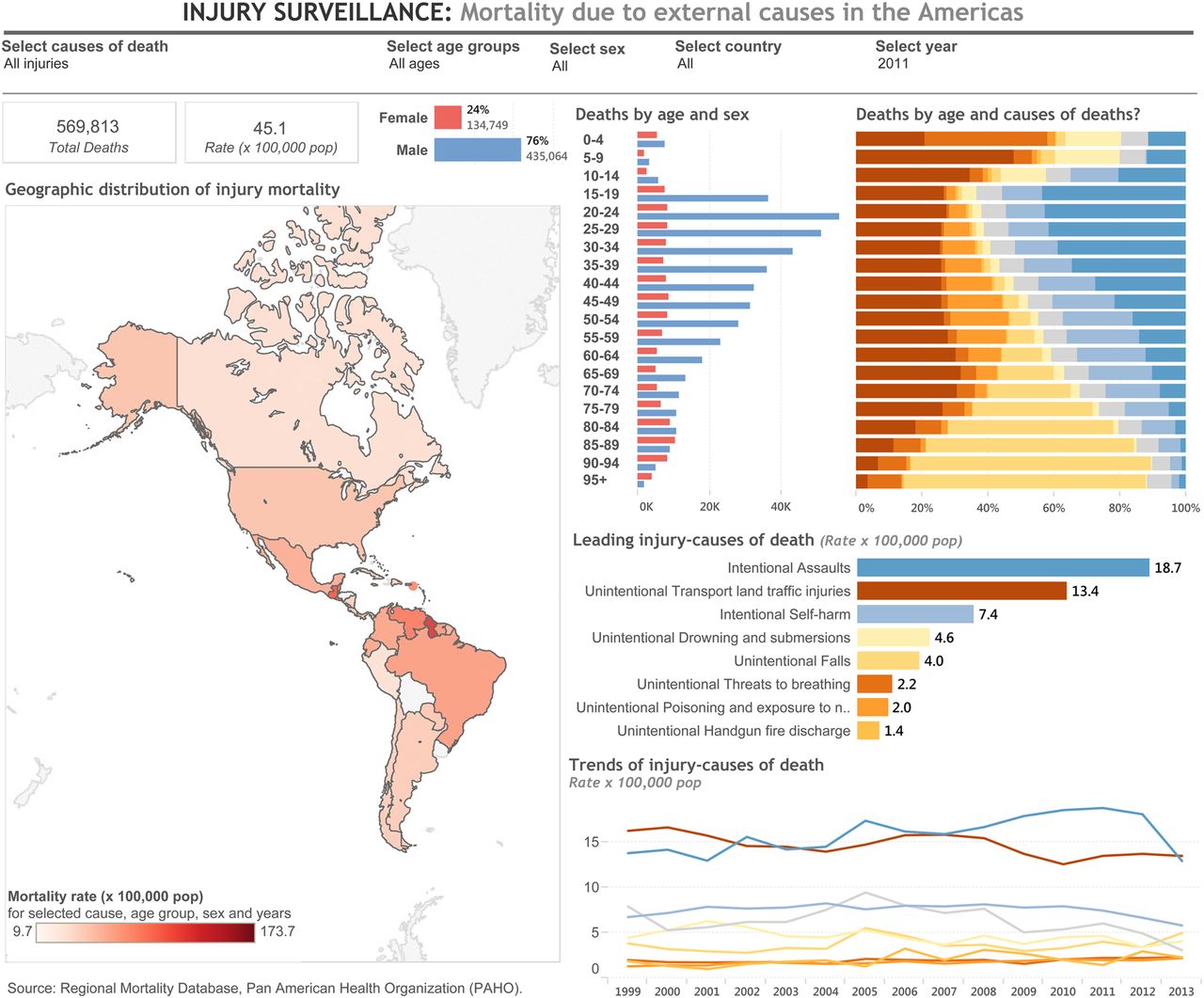
Public health surveillance of injury mortality in the region of the Americas, 1999–2013. Interactive visualisation available online http://bit.ly/1VmCt6e.
The surveillance team learned that more than 560 000 injury deaths (76% men and 24% women) occur yearly in the region of the Americas. The number of deaths is higher in men at young ages, and the top three leading injury causes are intentional assaults (homicides), unintentional transport land incidents and intentional self-harm (suicides). Diverse level and trends were found across countries.
Data visualisation was used as tool for sharing key findings with main stakeholders facilitating further data exploration and analysis, monitoring the situation of injury mortality, assessing disparities by causes and sharing underlying data. It informed about the need to evaluate national programmatic interventions to reduce mortality due to homicides, road traffic injuries and suicides; strengthen the regional strategy to reduce road traffic injuries, focalising efforts on vulnerable road users, such as pedestrians, motorcyclists and cyclists.
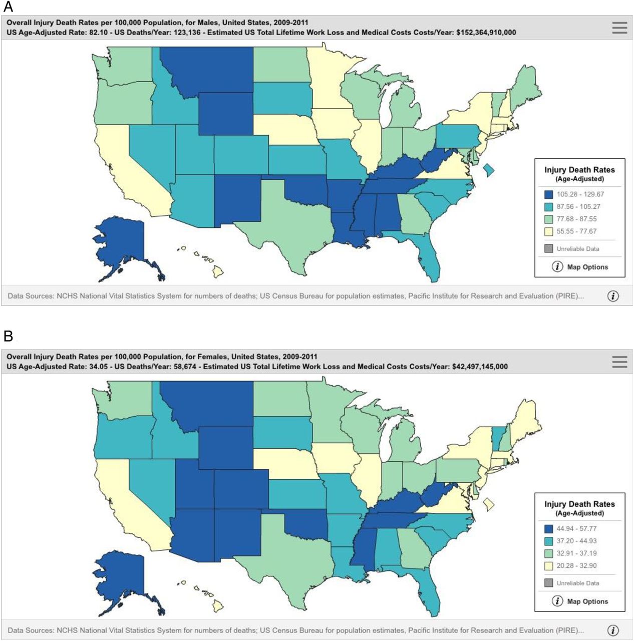
Case study 2: injury priorities in the USA
In this case study, a public health practitioner works for a non-government organisation (NGO), which aims to support IPC activities within the USA. This person has been asked to provide information to help his organisation decide on specific activities and geographic locations. He is not a trained or experienced researcher, so does not have the background or skills to conduct his own analysis on raw datasets that are publically available. His key questions include: (1) What is overall injury burden in the USA? (2) What are the leading causes of injury death? (3) Are there regional or state variations in burden?
He identifies numerous sources of US injury data, including several that are accessible through online querying systems and have visual analytic and data visualisation capabilities.17 He explores data systems that capture information on risky behaviours and that estimate the number of emergency department visits from injury and violence. He ultimately spends more time examining data on deaths because these include the most serious injuries and allows him to look at state-level burden.
Information on deaths comes from the US National Vital Statistics annual mortality data. Mortality data are based on death certificates issued in the USA. Each death certificate contains a single underlying cause of death, up to 20 additional multiple causes and demographic data, but the online system packages these data into the underlying cause of death grouped into the main injury causes.
Through basic access to the internet, he is able to query these data to ask his questions of interest. The systems allows the user to request reports on deaths by cause (mechanism) and intent (manner) of injury, census region/state of residence, race, ethnic origin, sex, age and years of report. Many of the findings and results can be presented as tables of numbers, or as visualisations such as graphs, figures and maps. For example, when examining injury deaths by states, the system gives the user map of the USA with each state a shade to represent death rates—darker is higher injury death rates. The user can rerun the maps for different injury causes or for specific age groups or years. Clicking on a state shows more information about number of deaths and death rate (figure 5).

Geographical distribution of overall injury death rates at state level, USA, 2009–2011. (A) Age-adjusted injury death rates for men. (B) Age-adjusted injury death rates for women.17
From this exercise, the public health practitioner learns that the leading causes of injury death in the USA are poisoning, motor vehicle traffic crashes, falls and suicides; however, the causes vary by age group and state. He presents some of his findings and visualisations to the leadership of the NGO, which is better informed in making decisions on activities and direction.
Visualisation tools helped the user query the data more efficiently since static graphs may require the user to run queries separately for each individual injury cause, and table outputs take longer to review and interpret. Available visualisation options allow the user to easily see and understand geographic and demographic differences, and to change querying options quickly. If numbers are of interest, these are also available through this platform.
General considerations
The potential of visual analytic and data visualisation in many areas of PHS has been illustrated by a number of applications, including the identification of relationships and patterns of foodborne vibriosis,18 population mobility and person-to-person contact across geographic space,19 integration of traditional and non-traditional datasets for disease bio-surveillance,20 monitoring animal and human health,21 Web technology and mapping tools was applied to injury surveillance study at a low-resource setting,22 and assessment of level, distribution and trends of homicides.23 A recent systematic review shows a set of visualisation and analytics tools for infectious disease epidemiology.24 Such types of applications and concepts could be used more for IPC.
Visual analytic and data visualisation concepts and platform could play a key role to shape the next generation of injury surveillance. Well-implemented VAVP allows integrating multiple data sources, assessing data quality, using data to analyse and describe current situations and conduct retrospective and predictive analysis in order to envision future injury prevention issues. As illustrated in cases studies, VAVP could improve data use, the analytic capacity and ability to effectively communicate findings and key messages.
Users of visualisations can experience a unique, hands-on opportunity to learn about the injury-related health problems across population groups by exploring seemingly endless combinations of data. The comprehensive assessment of concatenated factors and sequence of injury-related events can be improved by using data visualisation capacities, such as showing information from multiple angles in a single display, interactivity features that allow selecting and filtering data to answer further questions and building of stories. Data visualisation showing actionable metrics can tell a story and enable users to explore and find stories for driving actions and change.
The PHS community should identify opportunities to develop and expand the use of visual analytics and data visualisation for IPC.
What is already know on the subject
Injury-related health issues demands the usage of diverse and massive data sets for comprehensive analyses, and application of novel methods to communicate data effectively to the public health community, decision-makers and the public.
Current advances in information visualisation, availability of new visual analytic methods and tools and progress on information technology provide an opportunity for shaping the next generation of injury surveillance.
What this study adds
Conceptual bases for application of visual analytic and data visualisation in injury surveillance.
Proposal of a visual analytic and data visualisation platform as solution to improve current methods and practices of the public health surveillance for injury prevention.
Two real-world case studies illustrating the application of visual analytic and visualisation in public health surveillance for injury prevention and control.
Footnotes
Twitter Follow Ramon Martinez-Piedra at @HlthAnalysis
Contributors RM, PO, PNS and MFB conceived the idea, participated in the writing and revision of the manuscript. RM provided the conceptual bases and information regarding the visual analytic and data visualisation platform. RM and PO prepared the first draft. RM, PNS and PO elaborated the first case study, and MFB conceived and elaborated the second case study. All authors approved the manuscript.
Disclaimer The findings and conclusions in this report are those of the authors and do not necessarily represent the views of the CDC and the Pan American Health Organization.
Competing interests None declared.
Provenance and peer review Commissioned; externally peer reviewed.